Data Visualization With Redash: Overview, Guides, and Integrations
8 minutes
48
There’s plenty of business intelligence tools that help organizations make sense of their data. Some tools have become more sophisticated to work with. The rising complexity of big data may require you to look for tools to simplify the creation of dashboards with visualizations. In due time, Redash can assist your company.
Check out the ins and outs of Redash and see how exactly it helps organizations with data analysis.
What Is Redash?

Redash is a browser-based BI tool that allows businesses to connect to different data sources, visualize the data, and share it via links. The platform is open-source, easy to use, and can help you be productive without having to master complex software. It is available only as a self-hosted platform after the hosted Redash service was shut down in 2021.
SQL users can use the powerful online editor or create and reuse code snippets. In contrast, users with lower levels of technical sophistication can visualize your data by just dragging and dropping. The main objective is democratizing access to data, helping data practitioners collaborate, and empowering all teams to develop insights and make data-driven decisions.
Key Features
Redash positions itself as a turnkey solution for easy data analysis. These are the features that make it possible:
- Broad support for data sources: You’re already working with common databases and platforms, so it’ll be a smooth transition.
- Query results: Redash lets you join data from multiple databases or post-process queries. It does so by using the Query Results Data Source and running queries against results from other data sources. Bear in mind that large result sets will require more memory.
- Query editor: Use the schema browser and auto-complete features to compose SQL and NoSQL queries in no time.
- Visualization and dashboards: Combine different visualizations into a single dashboard with a simple drag-and-drop feature.
- Alerts: Set conditions for data changes and be notified as soon as the parameters are met.
- Schedule data refreshes: Your charts and dashboards will be automatically updated at an interval you set.
- Sharing and collaborating: Work on visualizations and their associated queries together with colleagues or external stakeholders or simply enable peer review of reports without editing access.
- REST API: The full functionality, available through the user interface, can be recreated through Redash REST API.
Getting Started With Redash
This section will guide you through the onboarding steps after you’ve created a new account on Redash. Once you log in, you’ll see the welcome screen asking you to connect a data source, create your first query, create your first dashboard, and invite your team members. Each option will be a separate link, which makes getting started a lot easier.
Adding Data Sources
To add new data sources to Redash:
- Click on the settings icon in the top-right header
- Go to the settings page
- Click + New Data Source under the Data Sources tab
- Browse through the list or type the required data source in the text box. You can type “SQL,” and the tool will automatically filter sources and display tools that match
- Fill out the information about the source and connect
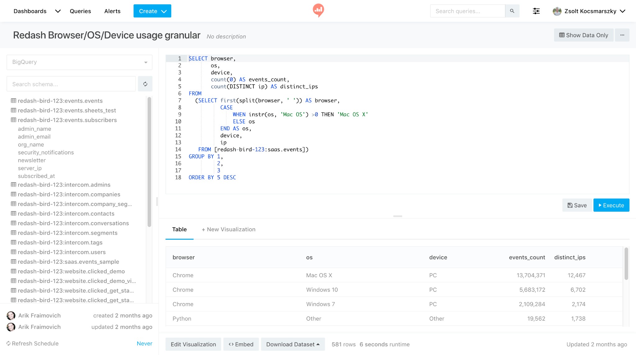
Writing Queries
To write queries in Redash:
- Go to the navigation bar and select Query
- Click Create
- Write the query itself
- Type the name of your query in the Query Editor (it works for SQL queries, too)
- Click Execute to view the results
Creating and Sharing Dashboards
To create a new Dashboard in Redash:
- Click Create and select Dashboard
- Enter the name of your Dashboard
- After being redirected to the Dashboard Editor, click Add Widget
- Choose the visualization type and click Add to Dashboard
- Click on Done Editing to save the changes
Inviting Colleagues
Click Publish at the top right and share the dashboard with your colleagues by sending the URL. You can add other users as editors in the upper-right settings.
Alternatively, you can go the other way around and place some restrictions to keep your data safe. When you generate a secret link, external users can open the URL and see widgets. Still, they won’t be allowed to navigate within the application or see the underlying queries. Secret links can be copied from the same Share pop-up window; you won’t miss it.
Toggle Allow public access to revoke access to break any links shared previously with external users.
Visualization Types Supported by Redash
Redash uses tables as the default view. But you can easily visualize your data with one of the dozen supported chart types:
- Boxplot – to get a visual summary of data and quickly identify mean values, the distribution of the data, and signs of skewness

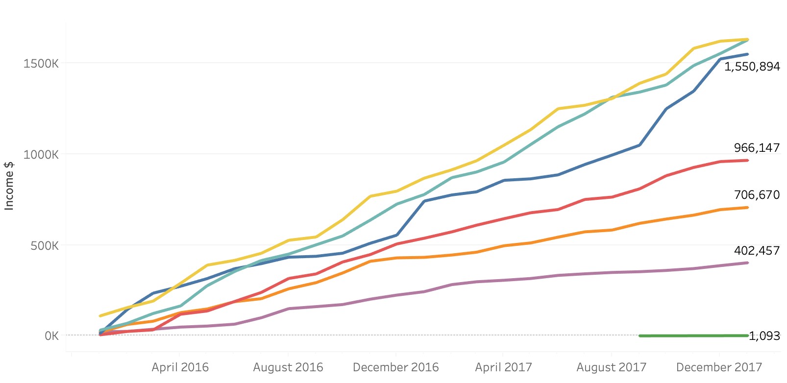
- Line chart – to demonstrate exact values across time relationships between data and reveal trends
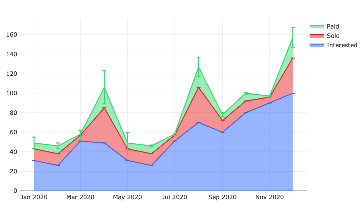
- Area chart – to visualize a volume change, pinpoint and compare overlapping data
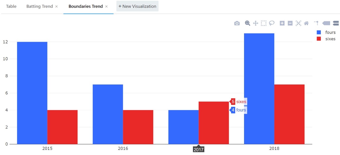
- Bar chart – to represent categorical data, highlight differences between categories, and emphasize a change in magnitude.
We won’t go over each visualization type in much detail, but here are possible scenarios where you might want to create them in Redash:
- Scatter chart (possible use case: analyzing a relationship between the number of students in a class and the points scored)
- Counters (possible use case: showing monthly recurring revenues for a SaaS product)
- Funnels (possible use case: monitoring churn across the customer’s journey – Sent, Viewed, Clicked, Added to Cart, and Purchased)
- Maps (possible use case: analyzing the geographical distribution of high-value clients)
- Pivot tables (possible use case: listing sales by rep, category, time period, etc.)
- Sankey diagrams (possible use case: tracking orders from dispatch to the intended consumers)
- Sunburst graphs (possible use case: grouping company structure as headquarters, controlled cooperation, and affiliated branches)
- Word clouds (possible use case: visualizing the most popular responses as voted by the crowd)
You can download your visualizations as local PNG files by hovering the mouse at the top right and clicking the camera icon.
Integrations and API
Redash supports SQL, NoSQL, Big Data, and API data sources, so you have a decent amount of options to query data from. If your company uses any of these databases, Redash will be a good match for you:
- Oracle
- Google BigQuery
- SQL Server
- PostgreSQL
- MongoDB
- Amazon DynamoDB
- Clickhouse
- Snowflake
- Impala, and 20 more
At the time of posting, Redash has under ten integrations:
- Google Analytics
- Google Spreadsheets
- JIRA
- JSON
- Python
- Salesforce
- Yandex AppMetrica
- Yandex Metrica
You can also connect your sources with partners:
- Segment
- Snowplow Analytics
- Stitch
Use Cases
The three primary use cases for Redash are competitive intelligence, lead analytics, and collaboration. As for business priorities, the tool is recommended for organizations looking to enhance customer relationships, increase sales & revenue, and scale best practices.
Most businesses that have implemented Redash are in the technology sector (Computer Software, Computer & Network Security, and the Internet). For example, Atlassian, Netlify, and Sentry. Customer testimonials claim Redash helped them make their “company more data-driven,” “display [their] progress to investors and partners in a simple and elegant way,” and “fill in the gaps where [their] other (more expensive) dashboard tools fall short.”
A much smaller percentage of clients seem to come from the consumer sector, much less from others. If your company doesn’t fit the “common client” description, Redash may still be a good fit. After all, there are analysts in every industry and in almost any modern organization.
Limitations
Redash isn’t the best when working on big data, at least in terms of speed, because it has to parse every record to display the data. If you’re not querying enormous amounts of data, the tool should handle the workload flawlessly.
In addition, some Redash users may feel limited by the visualization options, and the level of dashboard sophistication isn’t enough for presentations to external parties.
Finally, Redash users are recommended to possess an in-depth knowledge of SQL. There is a drag-and-drop feature, but analysts will be able to generate better visualizations and create dashboards using their SQL expertise.
Troubleshooting
When response times are high, check what exactly is taking a long time:
- Visit the query that’s taking too long
- Refresh it
- View the message that appears beneath the query editor
If it says “Query in queue,” it means there aren’t enough threads to handle too many concurrent queries. If it says “Executing” for a long time, either the query is the problem (for example, it’s a query with large results, a few hundred thousand or more) or something else that’s not part of Redash affecting the performance. There may be an issue with your database or network; the query will look like it’s executing, but in fact, it’s waiting for the data to reach your browser.
The message “Error Running Query: Worker exited prematurely: signal 9 (SIGKILL)” means that the runner ran out of memory. It’s normal for large result sets, so run the query once more.
Summary
Redash faces tough competition. Even among open-source business intelligence tools, there are strong contenders like Metabase, which has a similar set of integrations and supported data sources. Plus, Metabase allows you to integrate with a large set of lesser-known tools. With that said, Redash makes it easy to connect data sources, write queries, change data access and visibility, and it works great for companies that have deployed a number of applications for business process management.
One overview may not be enough to decide which tools to use and how to run your day-to-day operations. Besides, you need to consider the needs of different departments, be it Finance, Product, or Marketing. Consider chatting with a data analyst to pick tools and platforms that will make the most sense for your company and its needs.

We convert raw data into meanigful insights for you to make the best decisions.
Featured Articles
-

Top 5 Data Visualization Tools in 2023
A simplified representation of complex data is key for any data-driven business. Raw data must be turned into a cohesively formatted visual that is…
Read more -

SnowFlake: The Best Data Warehousing and Prescriptive Analytics Solution
Data Warehouse as a Service, or DWaaS, has gained much popularity in the past decade. It is a service primarily provided by Snowflake Inc,…
Read more -

Simple Mobile Analytical Stack: Firebase + BigQuery
Developing reliable and high-quality mobile and web applications requires a lot of dedication and, more importantly, a powerful and feature-rich development platform. Firebase, provided…
Read more