A new CDO walks into the office on a Monday. By Friday they have a list. Forty-seven dashboards. Six BI tools. Three different metric layers that all claim to be canonical. The CFO can name two dashboards by heart. The COO opens one of them on Monday mornings, scrolls to a single number, and closes the tab. Everything else on the wall is technically running, technically maintained, and operationally invisible.
In This Article
This is the situation almost every fractional CDO engagement begins inside. It is not a tooling problem. The dashboards are not ugly. The data is not broken. The dashboards have quietly stopped being load-bearing for any actual decision, and nobody can tell you when that happened. The first 30 days are the audit that produces the answer.
This is not an article about how to design a dashboard. That is covered separately in 10 Dashboard Design Rules, Six Years Later, which sits next to this article on the same site and covers naming, layout, whitespace, widgets, and the visual mechanics of building a dashboard somebody will open. This article is about what to do when you walk into a company that already has 47 dashboards somebody else designed, and the CFO opens two of them.
The deliverable at the end of the first month is a one-page memo. It names the three dashboards that should survive, the eight that should be rewritten, the rest that should be retired, and one number per surviving dashboard that the executive who opens it is allowed to argue with. Everything else this article describes is the apparatus that gets you to that page.
Four ways an executive dashboard quietly stops working
A dashboard fails in one of four ways. None of them are about design. All of them are about ownership, definitions, cadence, and what decision the dashboard is supposed to feed.
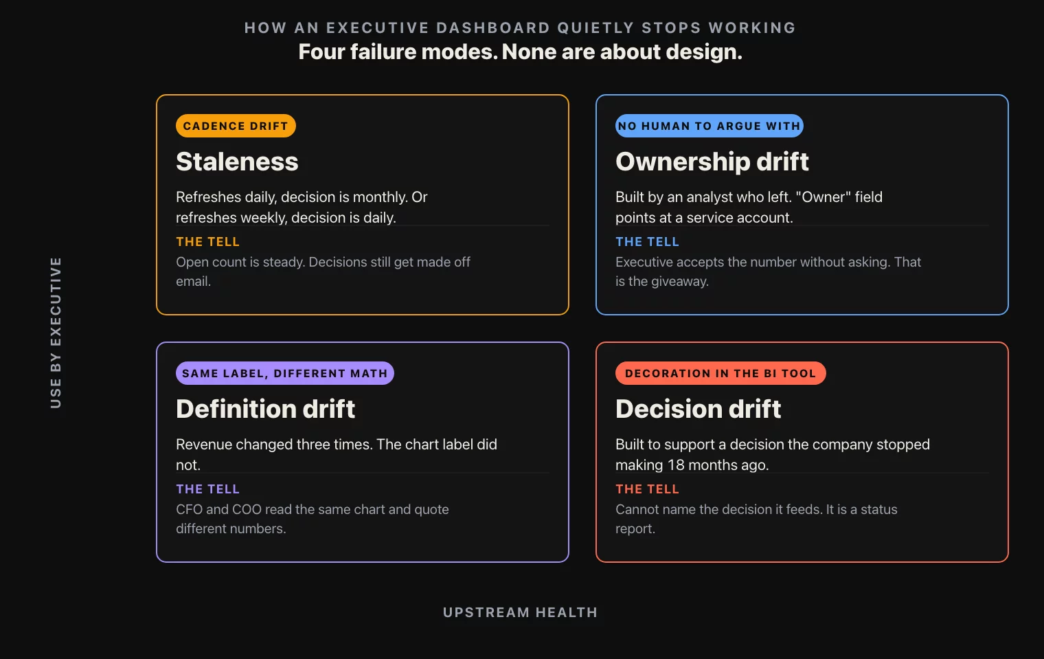
Ownership drift. The dashboard was originally built by an analyst who left the company eighteen months ago. The dashboard is technically maintained by a different analyst, who is not the person an executive can argue with. So the executive does not argue with it. They open it, they accept the number, they close it. Without a named owner who can defend each definition on the page, a dashboard becomes ambient noise. Most exec dashboards in mid-market retail and consumer companies have no documented owner. The “owner” field in the BI tool, if it exists, points at a service account.
Definition drift. The KPI on the dashboard is “revenue.” But revenue has changed three times in eighteen months. First it was gross, then it was net of returns, then it was net of returns and gift-card revenue but gross of marketplace pass-through. The dashboard label still says “revenue.” The CFO and the COO are looking at the same chart and silently using different definitions of the same word. This is the failure mode that produces the most expensive board meetings, because it is the failure mode no one in the room knows is happening.
Decision drift. The dashboard was built to support a specific decision the company no longer makes. The company used to allocate marketing budget weekly, the dashboard supported that decision, and now marketing budget allocation is a monthly process owned by Finance, not Marketing. The dashboard is still there, still updating, still being looked at. It just does not feed anything anymore. Every dashboard that does not feed a decision is decoration, and decoration in a BI tool is more expensive than decoration in an office because somebody is paying to keep it accurate.
These four failure modes are how dashboards die in companies that did everything else right. The audit is the apparatus that catches each one before the executive opens the dashboard the next time.
What makes this hard is that none of the four failure modes are visible from inside a single dashboard. The dashboard looks the same on the day it stops being load-bearing as it did six months earlier. The query still runs. The chart still renders. The label is still on the page. The decay shows up only when somebody looks across the portfolio of dashboards at the same time, asks the same five questions about each one, and writes the answers down side by side. That is what the 30 days actually buys.
The 30-question checklist, grouped by section
The audit is 30 questions, split into six sections of five questions each. Every dashboard the engagement inherits gets scored on all 30. The questions are deliberately blunt. If an answer is not a single sentence, the question scores zero.

Definitions. What does each KPI label on the dashboard actually compute. Where is that definition written down. Is the written definition the same as the SQL. When was the definition last changed. Who approved the change. The chart label “revenue” and the SQL behind it are two different artifacts that drift apart on their own schedule, and the only way to find the drift is to ask both questions side by side.
Ownership. Who is the named human owner of this dashboard. Who is their backup. Who can change a definition on it. Who reviews the change. What is the last date the owner reviewed the dashboard, end to end. An exec dashboard with no named owner has nobody to argue with, and an exec dashboard nobody argues with is a dashboard nobody trusts. The “owner” field in the BI tool counts only if the human in the field actually owns the dashboard, not if they were the last one to edit it.
Cadence. How often does the data refresh. How often is the dashboard actually opened, and by whom. Is the refresh cadence aligned to the decision cadence. If the dashboard refreshes daily but the decision is monthly, the noise on the daily view is making the monthly decision worse, not better. If it refreshes weekly but the decision is daily, the executive is operating on stale numbers and does not know it. Pull the BI tool’s audit log. The view-count tells you which dashboards are dead.
Decision linkage. What is the decision this dashboard supports. Who makes that decision. When. With what threshold. If the decision is “should we change the marketing budget,” the dashboard should show last month’s spend, last month’s incremental revenue, the trigger threshold, and the time since the last change. If the dashboard does not feed a named decision, it is a status report. Status reports are not exec dashboards. Status reports go in a weekly email and stop costing BI tooling money.
Failure modes. What happens if this dashboard is wrong. Who notices first. Within how long. Is there an alert. Is there a sanity check on the source. If the answer is “an analyst notices in the daily standup,” the dashboard is fragile. If the answer is “nobody notices,” the dashboard is already broken and is propagating wrong numbers into decisions. Every surviving dashboard should have at least one explicit test, automated or manual, with a named owner and a known cadence.
Six sections, five questions each, 30 questions total. A dashboard that scores 25 or higher is healthy. 15 to 24, rewrite the worst-scoring section. Below 15, retire it or rebuild it from scratch. The threshold is deliberately strict, because in retail and consumer companies the cost of an exec acting on a wrong dashboard once a year is larger than the cost of retiring fifteen dashboards that nobody opens.
The reason the checklist works as a 30-question grid, rather than a longer freeform interview, is that scoring forces a binary. An executive sponsor can read a 30-question grid in five minutes. They cannot read a 12-page audit. The grid is the artifact that makes the audit board-readable, which is the only reason the audit ever leads to actual retirement decisions.
What to ship at the end of week 4
The deliverable from the first 30 days is not a slide deck. It is a one-page memo with eight items on it. The memo is what the CFO and the COO read in three minutes on a Tuesday and what every subsequent dashboard decision references for the rest of the engagement.
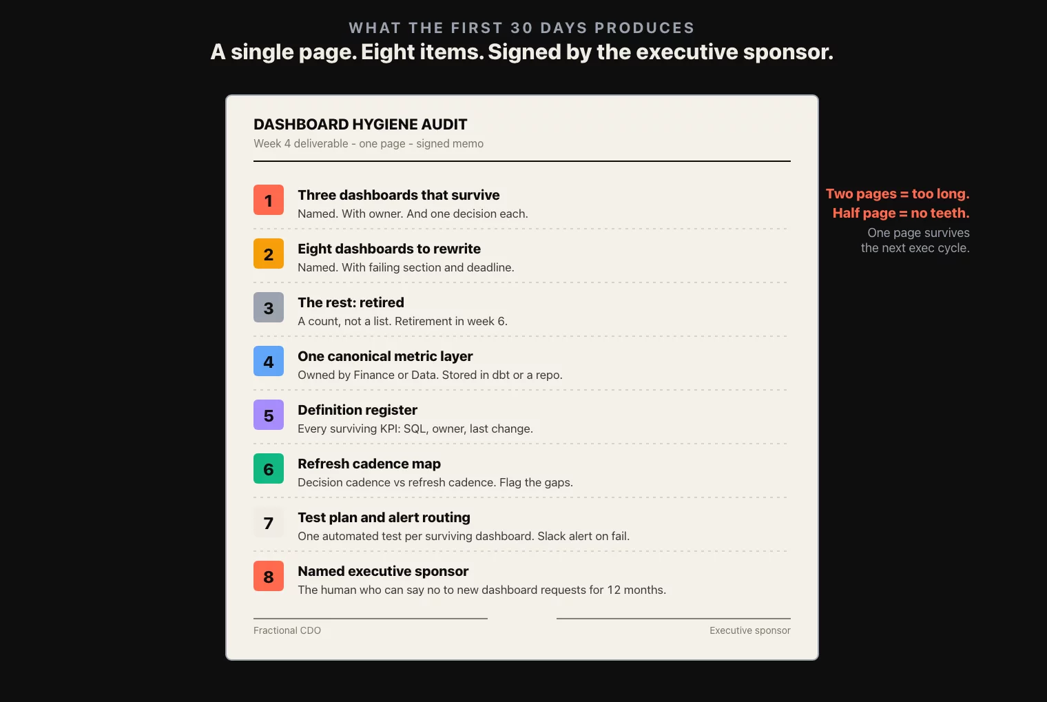
- Three dashboards that survive. Named, with their named owner, the one decision each one feeds, and the score out of 30.
- Eight dashboards that get rewritten. Named, with the scoring section that failed, the named owner who will run the rewrite, and the deadline for the rewrite spec.
- The rest that get retired. A count, not a list. Retirement happens in week 6 or 7 of the engagement; the memo just commits to it.
- One canonical metric layer. A single source for revenue, margin, traffic, conversion, retention, the four to six KPIs the executive team actually argues about. Owned by Finance or Data, not Marketing. Stored in a metric repository or a dbt project. Every surviving dashboard reads from this layer.
- Definition register. A list of every KPI on a surviving dashboard, with the definition, the SQL, the owner, and the last change date. Lives in a notion or confluence page that gets updated synchronously with the SQL.
- Refresh cadence map. Each surviving dashboard and the decision it feeds, with the matched cadence. Anything where decision cadence is more frequent than refresh cadence is flagged.
- Test plan. Each surviving dashboard, the at-least-one automated test on its source data, and the alert routing if the test fails. Tests run nightly; a failed test is a Slack message with the dashboard name and the broken metric.
- Sponsorship. The named executive who owns the survival of this audit, and who is allowed to approve a new dashboard request from any team in the company in the next twelve months. Without a single named sponsor, the audit gets reversed within a quarter, and the dashboard count is back at 47 by next year’s planning cycle.
Eight items, one page. The discipline is what gets the audit through the next executive cycle without dilution. Two pages is too long; the COO will read one of them and stop. Half a page is too short; the rewrites lose their teeth in implementation.
The memo is signed jointly by the fractional CDO and the executive sponsor. The signature is what makes the rewrites enforceable, because two months later when a team wants a new dashboard, the sponsor is the one who says no on the basis of this memo.
Three patterns to never ship
These are the three dashboard patterns that show up most often in mid-market consumer and retail audits, and that the audit should retire before the rewrite phase begins. Each one has a replacement pattern that the rewrite produces.
The vanity wall. Every chart the team could think of, on one page. Twelve charts, four data sources, no narrative. The executive scrolls to the first chart, decides it is too much, closes the tab. The vanity wall ships when the dashboard owner mistakes comprehensiveness for usefulness, and it ships against every rule in 10 Dashboard Design Rules because nobody enforced any of them at build time. The replacement is a single-decision dashboard with at most three charts and a one-line headline that names the decision.
The CFO PDF. A monthly board pack that is a PDF of screenshots of an Excel sheet that pulls from a manually-refreshed extract. It is technically a dashboard, in the sense that somebody has decided it is the artifact the board looks at. It is also a recipe for definition drift, because the screenshots disconnect the numbers from the underlying SQL. The replacement is a live dashboard with a print-to-PDF view for the board pack, the same numbers, refreshed from the same source, but with the definitions on the underlying page one click away.
The “we built it once” dashboard. The dashboard built two years ago to support a specific launch, that never got retired. The launch is over. The team that built it has moved on. The dashboard runs. It is in the BI tool’s hot list. Nobody looks at it. It costs query budget and warehouses anxiety into anyone who clicks it accidentally. The replacement is retirement, plus a documented decision that any project-specific dashboard ships with an expiration date in its title.
Each of these three patterns is the same failure: a dashboard that lasted past the decision it was built for. The audit’s job is to catch them all in week 1 and decide on each by the end of week 4.
What to do this week
If you do not have a fractional CDO on the way and you want to start the audit yourself, three actions before next Monday.
Open the BI tool’s audit log. Pull the view-count per dashboard for the last 90 days. Sort descending. Anything in the bottom half by view-count is a retirement candidate. The bottom quartile is almost certainly already dead and just running.
For the top five dashboards by view-count, pull the name of the human owner from the metadata field. If three or more of the top five point at a service account, an analyst who left, or a generic “data team” label, the ownership problem is structural and the rewrite spec needs to fix it before any single dashboard does.
Pick the dashboard the CFO opens most often. Ask the CFO, in one sentence, what decision they make based on it. Then ask the analyst who maintains it, in one sentence, what decision it is supposed to support. If the two sentences are different, the dashboard has a decision-linkage problem, and that is the dashboard the audit starts with.
Three actions, two afternoons. They do not produce the audit. They produce the question the audit is going to answer, which is the same question every fractional CDO engagement starts with: which two of these dashboards are load-bearing, and what is the next 30 days going to do about the rest.