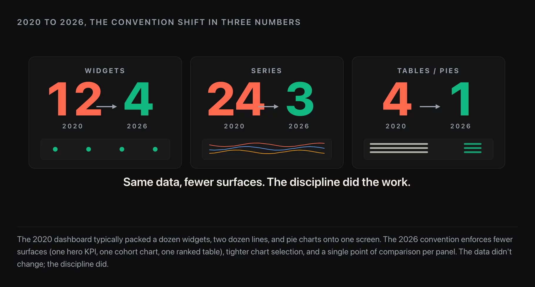
When we adapted Slava Shestopalov’s “10 rules for better dashboard design” in late 2020, the list felt close to definitive. Five years later, after applying the same rules across engagements with growth, finance, ops, and analytics teams, I think nine of the ten still hold. One of them needs a hard rewrite. A few of them shifted from “good practice” to “the BI tool enforces this for you by default,” which is itself worth noting because it changes which rules are still load-bearing for an analyst to think about.
In This Article
- Rule 1. Define the dashboard’s purpose
- Rule 2. Choose the right data representation
- Rule 3. Be consistent about naming, dates, and abbreviating large numbers
- Rule 4. Lay out the information flow and prioritize
- Rule 5. Use composite elements (widgets/cards) with a consistent internal structure
- Rule 6. White space is not wasted space (“Double your profit”)
- Rule 7. Don’t hide information, don’t rely heavily on interactions
- Rule 8. Personalize, don’t customize
- Rule 9. Tables and lists should be interactive and properly aligned
- Rule 10. Design the dashboard last
- What’s missing from the original list in 2026
- A working checklist for 2026
- Further reading
This is the original ten, in their original order, with a 2026 update under each.
Rule 1. Define the dashboard’s purpose
The original rule splits dashboards into two practical types: operational (real-time, drives immediate action, the “digital control room”) and analytical (slower, drives understanding and decisions, not immediate action). Mixing them by accident is the most common dashboard problem: an executive opens what they think is an analytical view and finds noisy operational metrics; an on-call engineer opens what they think is an operational view and finds week-over-week trends instead of current state.
2026 update. The rule holds, and the failure mode is unchanged. What’s new is a third category that the original article didn’t have: embedded/self-service dashboards where a customer (not a colleague) is the user. The purpose question becomes more important, not less, because the consequences of getting it wrong now reach external users. The discipline is the same: name the purpose before the visuals.
Rule 2. Choose the right data representation
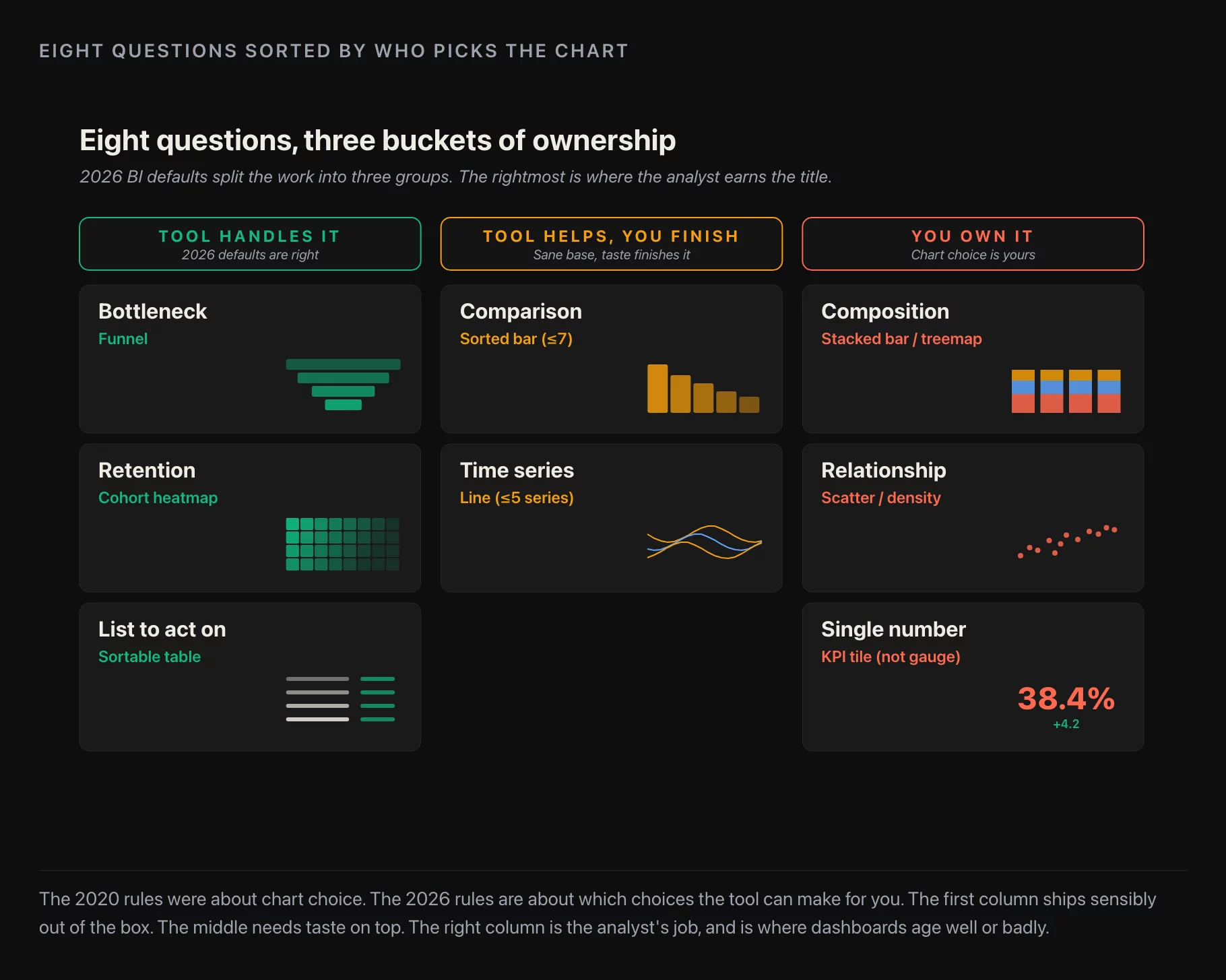
The original goes through chart-by-question logic in detail. Scatter and network charts for relationships. Bar and line for comparisons (with the specific guidance: time on the X-axis, sort bars by value rather than randomly, no more than 5 series on a line chart, no more than 7 categories on a bar). Pie and donut charts are easy to abuse and hard to read. Avoid 3D charts and gauges — they reproduce physical objects in pixels for no analytical benefit.
2026 update. Most modern BI tools now default to a reasonable chart for the shape of the data, and the canonical-chart conversation has gotten less interesting as a result. Two pieces of the original advice are now more important than they were in 2020: the 5-series limit on line charts (dashboard tools are happy to put 12 series on one chart and the reader gives up) and the gauge rule (gauges are back in vogue in some BI tools as a “KPI widget” and they’re still bad). The original’s caution against 3D charts is now redundant — almost no major tool ships 3D charts by default anymore.
Rule 3. Be consistent about naming, dates, and abbreviating large numbers
The 2020 rule is short and uncontroversial: pick one naming convention, one date format, one abbreviation style ($1.4M not $1,400,000) and use it across every chart on the dashboard. The biggest win is consistency, because the reader’s eye learns the conventions once and then trusts them.
2026 update. This rule moved from “good practice” to “non-negotiable” with the rise of the semantic layer. dbt, Cube, LookML, Metabase‘s semantic layer, AtScale — they all enforce naming and formatting at the metric definition layer, not at the chart layer. The dashboard inherits the convention from the model. Teams that still pick naming at the chart layer in 2026 are paying a tax: every new chart is a small chance to drift from the canonical name, and the eventual reconciliation is the expensive part.
Rule 4. Lay out the information flow and prioritize
The original rule is about grids and reading order. Top-left of the screen draws the eye first (in left-to-right reading cultures); place the most important information there. Group related items so the reader doesn’t have to jump back and forth. Grids hold the layout together.
2026 update. Grid-based layouts are now the default in every major BI tool, with proper responsive breakpoints. The reader-flow part of the rule still requires effort, though: the BI tool can’t tell you which metric is most important. That’s still a conversation with the stakeholder, and that conversation gets skipped on most dashboards I review.
Rule 5. Use composite elements (widgets/cards) with a consistent internal structure
The 2020 rule says: each widget on the dashboard should follow the same convention internally. Title in the top-left. View/action controls in the top-right. Content in the middle. When every widget follows the same structure, the reader’s eye learns it once and reads the rest of the dashboard fast.
2026 update. This is now table stakes — Metabase, Looker, Superset, Tableau, and Hex all enforce a card structure with the title where the rule says it should be. The interesting 2026 variant is that “controls in the top-right” now sometimes means an AI-explain button or a “summarize this chart for me” prompt. The rule still applies; the controls just include more.
Rule 6. White space is not wasted space (“Double your profit”)
The original article uses the headline “double your profit” with a deliberately tongue-in-cheek tone: the practical rule is that doubling the margin between widgets (the example uses 12px vs 24px) makes the dashboard noticeably easier to read. White space is an element, not the absence of one.
2026 update. The rule holds. The 2020 instinct to fill every quadrant is still strong — I see it on most dashboards I’m asked to review, and the fix is still the same: increase the margin and reduce the count of charts on the screen. The 2026 dashboard tools default to slightly more whitespace than the 2020 ones did, which helps a bit. The mistake teams make is overriding the defaults to “fit more in.”

Rule 7. Don’t hide information, don’t rely heavily on interactions
The 2020 article is direct: don’t build a “long scrolling dashboard” because the reader doesn’t scroll. Don’t build a dashboard where the answer lives behind two tabs and a click, because the reader doesn’t click. The original calls the long-scroll pattern an “Empire State Dashboard” — visually impressive, functionally useless. The recommended cap is 5-7 widgets per view.
2026 update. This rule needs a partial rewrite. The 5-7 cap holds, and the long-scroll critique holds, but the “don’t rely on interactions” part doesn’t quite. The 2026 reality is that the best dashboards I see use interactions deliberately: cross-filtering between two widgets, a date-range filter that updates all charts, a drill-down from a summary tile to a detail view. The reader does interact, when the interaction is obvious and the default state is already useful. The amended rule: defaults must be answerable on a glance; interactions earn their keep when the answer-on-glance is already there.
Rule 8. Personalize, don’t customize
The 2020 distinction: personalization is what the system does for the user (role-based content, prefilled filters, “your team” defaults). Customization is what the user does themselves (drag widgets around, save layouts). The 2020 advice is to lean on personalization first; offering customization as an escape hatch is fine, but it’s often a substitute for the harder work of figuring out what each user actually needs.
2026 update. This rule got more relevant, not less. With LLM-driven dashboards arriving in tools like Hex, Mode, and Metabase, the temptation is to push the personalization-vs-customization tradeoff onto the model: “ask the AI what to put on your dashboard.” The original rule’s caution still applies: an AI that lets every user customize their own view doesn’t replace the discipline of understanding what each role needs by default. Personalization remains the harder, more valuable side.
Rule 9. Tables and lists should be interactive and properly aligned
The 2020 article makes a quick but useful point: when a table is the right answer (e.g. a customer list with status, contact, last activity), the table needs sort, filter, and pagination, and the columns need to be aligned correctly — numbers right-aligned, text left-aligned, headers consistent.
2026 update. The rule holds and the BI tools mostly enforce alignment correctly by default. What’s new is that more dashboards in 2026 should be tables and aren’t. Mid-sized B2B SaaS dashboards in particular over-index on summary tiles and chart cards when the work the user is doing is “go through this list of accounts and check on each one” — which is a table. If the underlying task is enumeration, the dashboard should be a table, not a wall of tiles.
Rule 10. Design the dashboard last
The original rule: build the rest of the product first, because the dashboard is a summary of the rest of the product. Designing it first means rebuilding it every time you add a screen elsewhere.
2026 update. The rule still holds for product-embedded dashboards. For analytics dashboards in BI tools, the equivalent rule in 2026 is build the metric definition first, then the dashboard. If the metric lives in the BI tool (defined as a query right on the chart), then every dashboard becomes its own metric definition, and reconciliation across dashboards is endless. If the metric lives in dbt or a semantic layer first, the dashboard is genuinely a presentation layer and “design it last” is the right sequence.
What’s missing from the original list in 2026
The 2020 list doesn’t include three things that I’d add if I were writing the list fresh today:
11. The dashboard is not the final layer. It feeds the Slack message, the Notion doc, the Monday update. Design dashboards so the chart screenshots cleanly, the number copy-pastes, and the URL is a stable link. Most “send me that chart” requests go away when this is built in.
12. Mobile-or-honest. Either commit to a mobile-friendly layout (one column, taller, prioritized top-to-bottom) or accept the dashboard is desktop-only and put a banner on the mobile view saying so. The 2020 advice (“build responsive dashboards”) doesn’t work in practice — BI tool responsive modes are still mediocre — and pretending otherwise produces a dashboard that nobody uses on their phone.
13. Comparisons are mandatory. A metric without “compared to what” is rarely useful. Every number on a dashboard should answer “vs last period / vs plan / vs peer / vs target.” Pick one comparison per metric; don’t pick all of them.
A working checklist for 2026
Before you ship a dashboard:
- Purpose is named in one sentence (operational / analytical / embedded)
- Each chart is the right type for the question, with the 5-series / 7-category limits respected
- Naming and formatting come from the semantic layer, not from the chart
- Grid layout, key information top-left
- Every widget follows the same internal structure (title TL, controls TR)
- Margins double-checked (the 24px test)
- 5-7 widgets per view; interactions earn their keep
- Personalized by role; customization is an escape hatch, not the primary UX
- Where the task is enumeration, the answer is a table, not a wall of tiles
- Dashboard built after the metric definitions stabilize
- Screenshots cleanly; URLs are stable; mobile view is either committed-to or signposted
- Every metric has an explicit comparison
If any of those fail, the dashboard isn’t ready for an executive yet. It’s still in review.
Further reading
- Migrating Off Redash, For The Last Time — picking the BI tool that the dashboards above live in
- Cohort Analysis in 2026: Beyond Redash, Beyond Mixpanel — what a well-designed cohort dashboard looks like in practice