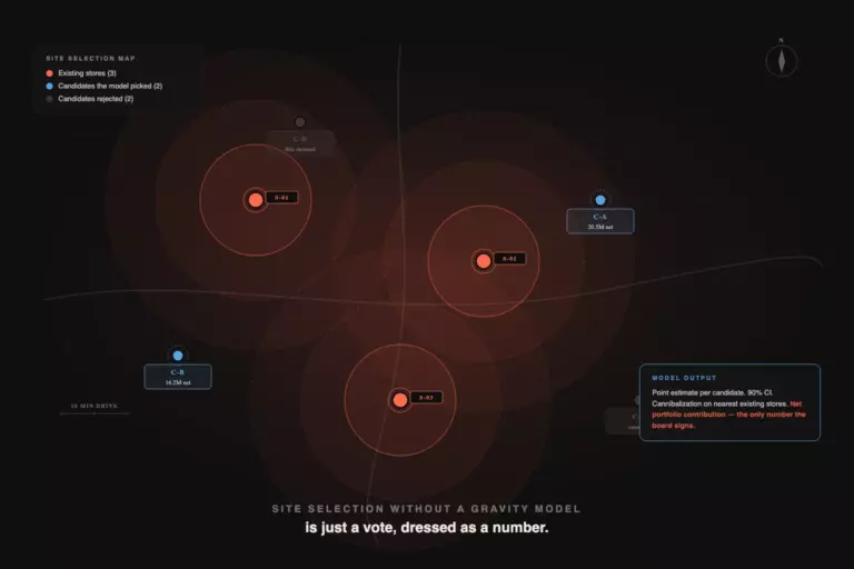
The chart on the slide is a twelve-slice pie. The slices are color-graded from teal to lavender. The CEO is checking her phone. The CFO is asking which slice represents the regional warehouse rebuild, because two of the slices are the same shade of muted blue. The analyst at the front of the room is explaining that the data is correct.
In This Article
The data is correct. The chart is a failure.
The reason it fails is not aesthetics, and it is not Excel. It is that the chart answers a question the room is not asking. The executives in this meeting want one of five comparisons. The analyst chose the chart type from a dropdown, and the dropdown defaulted to a pie.
This article is about the editorial discipline behind that mistake. It comes from Gene Zelazny’s Say It With Charts, the McKinsey-internal reference that has been the working answer to “which chart type” since the early 1990s. Zelazny’s argument is older than your BI tool. It still holds.
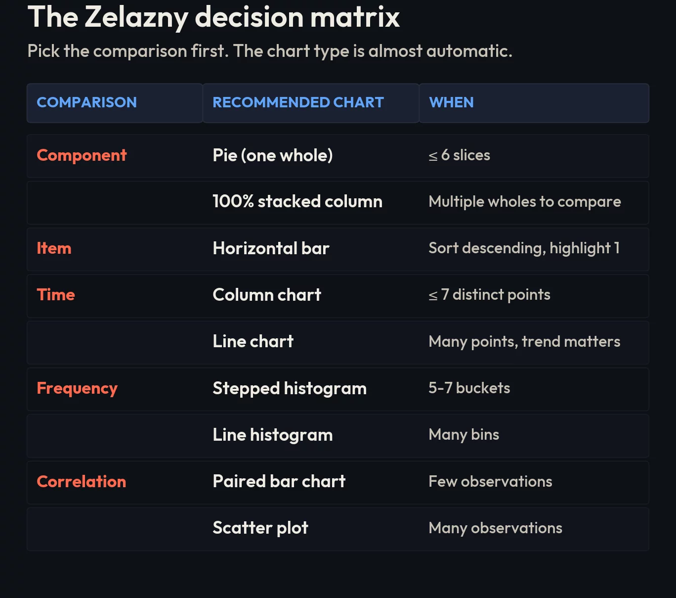
The five comparisons that cover every business chart
Any business idea you can put on a chart is one of five comparisons. There are no others.
- Component: each part as a percent of one whole. “Online makes up 38% of the channel mix this quarter.”
- Item: ranking discrete things side by side. “The Midwest region outperforms the other three by margin.”
- Time-series: how one thing moves across continuous time. “Q3 revenue stalled.”
- Frequency: how often values fall into intervals. “Order sizes cluster around $40, with a long tail to $400.”
- Correlation: whether two things move together. “Stores in higher-rent districts have lower customer return rates.”
Read your own draft headline before you open the chart wizard. Which of these five is it? Once you know, the chart type is almost automatic.
The five charts every executive respects
These five chart types, used in their natural slot, account for roughly 90% of all the charts a competent analyst needs to publish in a year.
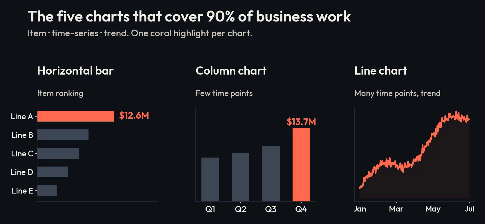
Horizontal bar chart, for item comparison
Item comparison is ranking. “Which of our ten product lines pulled the most revenue last quarter?” A horizontal bar chart, sorted descending, with one bar colored to highlight the answer in the headline, is the right tool every time.
Zelazny’s specific guidance: the gap between bars should be narrower than the bars themselves. Use the most contrasting color for the bar that proves the headline. Pick either a number at the end of the bar or a scale at the top, never both at the same time. This is not aesthetic prudery. Both at once is visual noise that erases the very contrast the chart was supposed to surface.
Column chart, for time-series with a small number of points
Quarterly revenue for the last six quarters. Monthly active users for the last eight months. Two years of holiday-season sales, year by year. These are time-series with discrete, countable buckets, and the right tool is a column chart: vertical bars, time on the horizontal axis moving left to right, the way readers already process time.
The rule of thumb: if you have seven or fewer time points and you want the audience to read precise values at each one, use columns. If you have many more than that, switch to a line.
Line chart, for time-series with many points
Daily logins over a year, weekly churn rate over thirty months, an interest-rate series across two decades. The line chart is what you reach for the moment the columns start to look crowded. The line carries the trend, and the trend is the whole point.
Zelazny’s editorial rule: the trend line itself should be thicker than the axis, and the axis should be thicker than the grid. This is the visual hierarchy of attention. The grid is the football field’s chalk, not the players. If your reader’s eye is drawn to the gridlines, the chart has failed.
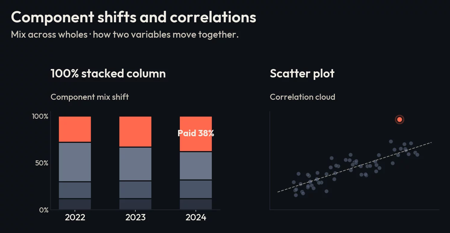
100% stacked column, for component comparison across multiple wholes
The pie chart is fine for one whole. It is wrong as soon as you have two or more wholes to compare side by side. Two pies side by side force the reader to mentally rotate slices, find common categories, and estimate angle differences. Nobody is good at this.
The 100% stacked column does the same job better. Vertical columns, each one normalized to 100%, with the same categories stacked in the same order across all columns. Lines drawn between equivalent segments make cross-column comparison automatic. Use this when the headline is “our channel mix shifted between last year and this year” or “product A’s customer base skews younger than product B’s”.
Scatter plot, for correlation
Correlation is when you want to know whether two variables move together: ad spend and lift, price and volume, customer tenure and lifetime value. Scatter plots are the only chart type that visually carries this relationship across a meaningful number of data points.
Zelazny’s practical adjustment: if you have only a handful of paired observations, a paired bar chart can communicate the comparison more cleanly. The scatter shines once you have enough points that the cloud shape itself is the message.

The five charts your analysts keep showing them anyway
This is where editorial discipline gets violated. The chart wizard defaults to the wrong tool, the analyst clicks through, and the executive room squints. Each of these five has a better answer that almost always uses one of the five chart types above.
Pie charts with more than six slices
Zelazny’s empirical observation, still true four decades later: the pie chart is the most overused chart type in business presentations. He estimated it should account for around 5% of all charts. In real decks it accounts for closer to 30%.
Pies with more than six slices are unreadable. The eye cannot estimate slice angle accurately once slices get small, the labels run off the chart, and the legend forces a back-and-forth scan that the reader will not do. If you have more than six categories, you have one of two situations: either group the smallest into an “other” bucket and use a pie with five real slices, or move to a sorted horizontal bar chart and abandon the pie. The bar will almost always be the right move.
The single exception is one pie chart on a slide where the entire message is “category X is overwhelmingly dominant” and you want the visual weight of that dominance to land. One slice. One number. One sentence headline.
3D anything
Three-dimensional bar charts, 3D pies, 3D area charts. They distort. The reader cannot tell whether to measure the height at the front or the back of the column. The perspective foreshortens later data points. Anyone who has read a financial chart knows that 3D is the visual vocabulary of a company that wants you to misread the numbers.
Use 3D when you are presenting actual three-dimensional data (a heatmap of warehouse pick locations, an actual physical model). Otherwise it is decorative noise that costs you trust.
Spaghetti line charts
Eight competitors plotted on the same axes in eight slightly different colors. The reader cannot distinguish the trend that matters from the seven that don’t. The chart is not communicating; it is performing thoroughness.
The fix is small multiples. Split into four or five separate line charts, each comparing your company against one competitor, with your company’s line in the same bold color across every panel. Yes, this is more work. The chart is also legible, which the original wasn’t.
If you absolutely must keep one chart, gray out every line except the one that proves the headline, and label it directly on the line rather than via a legend.
Dual-axis charts
The classic: revenue on the left axis, marketing spend on the right axis, two lines that look like they move together. The implication is causation. The reality is that you can make any two trends look correlated by picking axis ranges that align them visually.
Dual-axis is almost never the right chart. If you want to show that two series move together, plot them as small multiples and let the reader compare shapes. If the actual claim is “marketing drives revenue,” show the actual correlation, not a visual coincidence.
Anything from the “Other Charts” submenu
Funnel cones, pyramids, radar charts, gauge dials, donuts with a number in the middle. Each one started as a useful idea for a narrow case and ended up as a default on someone’s dashboard for the wrong job. A funnel with five stages is just a bar chart laid sideways with the bars getting visually narrower for no reason. A radar chart with eight axes is unreadable on the way to “comprehensive.” A speedometer is the worst KPI tile shape ever invented because the eye reads the gradient before the number.
The fix is the same as everywhere else. Identify the comparison. Pick the chart from the five.
The editorial part
Picking the right chart is necessary, but it is the floor, not the ceiling. The piece that separates a competent chart from one that lands is the title and the highlight.
Most analysts write descriptive titles: “Q3 revenue by region.” A descriptive title makes the chart a lookup table. The reader has to read the chart, find the high bar, decide what the high bar means.
Make the title a sentence. Not “Q3 revenue by region,” but “Midwest pulled $4.2M, ahead of every other region for the third quarter running.” Now the chart proves the headline. The eye finds the colored bar that matches the sentence, confirms the number, and the reader moves on. That is the executive experience worth designing for.
The second piece is the highlight. Every chart should have one thing colored differently from the rest, and that thing should be the answer to the title sentence. The other bars stay neutral. The chart is then doing what it should: showing the audience the answer, not asking them to find it.
What to do tomorrow
Open the deck you are presenting next, and for every chart in it, write one sentence that answers the question “what is this chart for?” If the sentence does not contain a number or a comparison, the chart is not yet a chart. Then look at the chart type. If it is one of the five misused ones above, swap it for the right one from the five-comparison map and rewrite the title as a sentence.
The math is the same. The decisions the room makes will be different.