Outliers are the points that make summary statistics lie to you. A single trailing zero in a data entry turns the mean into a sales-floor decoration. A real but rare event (the millionaire in the income survey, the marathon in the daily-steps log) drags the regression line out of the cluster. Before you can decide what to do about them, you need to find them, and “find them” is harder than it sounds because there is no single correct definition of an outlier.
In This Article
This is a tour of six methods I use in R, when each one is appropriate, and what the same dataset looks like under all of them. We will use the mpg dataset that ships with ggplot2, specifically the hwy column (highway miles per gallon across 234 cars), because it is small, public, and has a believable shape with a few real outliers at the top.
The methods split into two groups. The first four make no assumption about the distribution: you look at quantiles or medians and flag anything outside a range. The last three are formal statistical tests that assume approximate normality and return a p-value. They cost a real package import and a real interpretation, and they earn their keep when you need to defend the call in a stakeholder review.

Setup
library(ggplot2)
library(outliers)
library(EnvStats)
library(dplyr)

dat <- ggplot2::mpg
summary(dat$hwy)
# Min. 1st Qu.  Median  Mean 3rd Qu.   Max.
# 12.00   18.00   24.00 23.44   27.00   44.00
234 rows. Min 12, max 44, median 24. Right-skewed because a handful of small efficient cars push the upper tail. That is the field we will run through every method below.
Method 1: descriptive statistics and the histogram
The first move with any continuous column is always the same: print summary() and plot a histogram.
hist(dat$hwy, breaks = sqrt(nrow(dat)), xlab = "hwy", main = "Histogram of hwy")Square-root binning is a defensible default for an unfamiliar column (a little coarser than Sturges’ rule, a little finer than Scott’s). What you are looking for is the shape of the body and the presence of detached bumps in the tail. If the histogram is unimodal and the tail decays smoothly, there are probably no scary outliers. If the histogram shows a body and then a tiny isolated bar far from the body, that is your candidate.
For hwy, the histogram shows a clear mode around 24 to 28, a long left tail down to 12, and a small cluster around 40. Those 40-ish values are the suspects.
This is not a detection method by itself, it is the question that the other methods will answer. Always look at the shape before you flag anything.
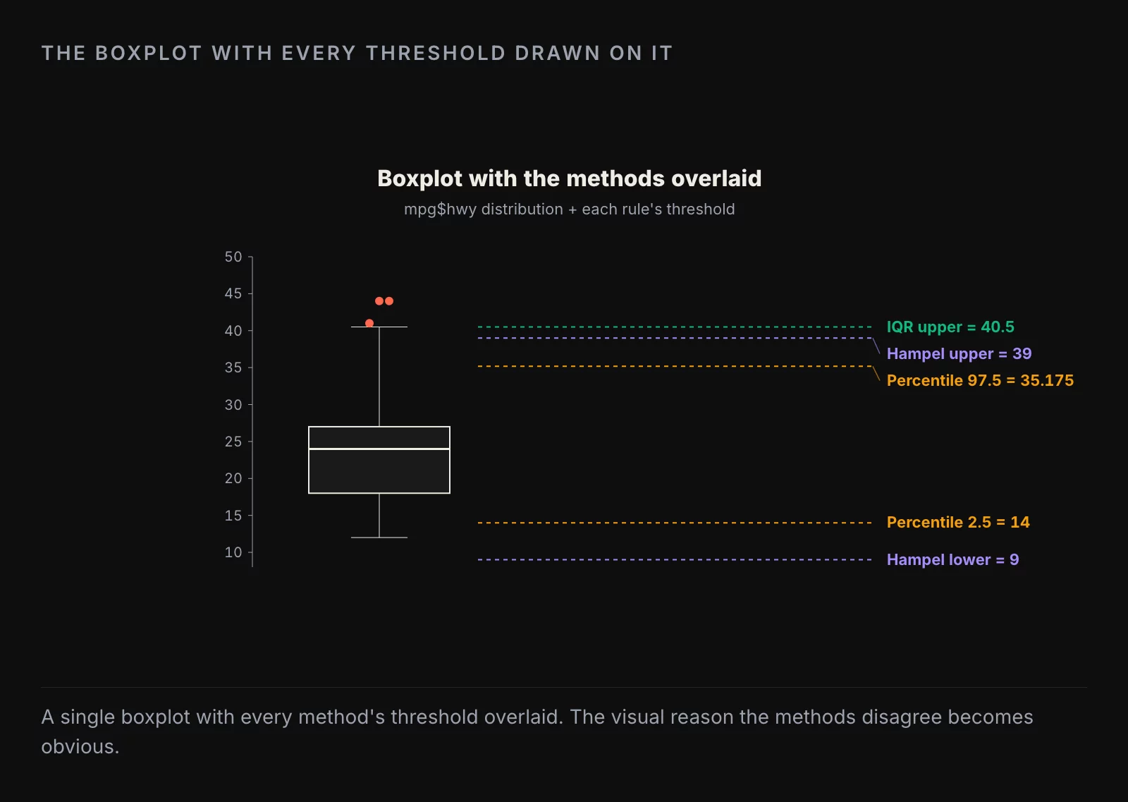
Method 2: the boxplot and IQR rule
The boxplot is the visual default and the IQR rule is the math behind it. A point is flagged if it falls outside the interval [Q1 - 1.5 IQR, Q3 + 1.5 IQR], where IQR is Q3 - Q1.
boxplot(dat$hwy, ylab = "hwy")
boxplot.stats(dat$hwy)$out
# [1] 44 44 41
Three flagged values, all on the upper tail. The IQR rule has two virtues: it makes no assumption about the distribution, and it is the thing everyone already knows from a high-school stats class, so explaining it in a report is free. Its weakness is the 1.5 multiplier, which is a Tukey-era convention with no deep justification. With a heavier-tailed distribution it will flag too many; with a perfectly normal distribution it will flag about 0.7 percent of points by chance.
For exploratory work and dashboards, the IQR rule is the right first cut.
Method 3: percentile cutoffs
Pick the bottom and top percentile you are willing to call an outlier. The conservative choice is 2.5 / 97.5; the more aggressive is 1 / 99.
lower <- quantile(dat$hwy, 0.025)  # 14
upper <- quantile(dat$hwy, 0.975)  # 35.175
sum(dat$hwy < lower | dat$hwy > upper)
# [1] 11
Tightening to 1 / 99 reduces the count to 3, the same as the IQR rule but at different positions. The percentile method has the same distribution-free virtue as the IQR rule but trades the 1.5-IQR convention for a percentile choice that is at least transparent: you said “I am flagging the most extreme 5 percent,” nobody can argue you did not.
It also makes outliers a proportion rather than a property of the data, which is the right mental model when the dataset can grow. If you flag the top 1 percent on a stream of incoming events, the threshold updates as new data arrives.
Method 4: the Hampel filter
The Hampel filter uses the median and the median absolute deviation (MAD) instead of the mean and standard deviation. Anything outside [median - 3 MAD, median + 3 MAD] is flagged.
lower <- median(dat$hwy) - 3 * mad(dat$hwy, constant = 1)  # 9
upper <- median(dat$hwy) + 3 * mad(dat$hwy, constant = 1)  # 39
sum(dat$hwy < lower | dat$hwy > upper)
# [1] 3
The MAD is computed as the median of |x - median(x)|, which makes the whole rule resistant to extreme values in a way the standard deviation is not. The 3-MAD bound is the rough analog of the 3-sigma bound on a normal distribution.
The Hampel filter is the right choice when the data has a few wild values that would inflate the standard deviation enough to hide other outliers (a problem called “masking”). It is the default in signal-processing contexts for the same reason.
Method 5: Grubbs test
We move from rules-of-thumb to formal hypothesis tests. Grubbs assumes approximate normality and tests one extreme value at a time. The null is “all values come from the same normal distribution”; the alternative is “the most extreme value is from a different distribution.”
test <- grubbs.test(dat$hwy)
test$p.value
# [1] 0.05555
A p-value of 0.056 means we just barely fail to reject the null at the conventional 0.05 threshold. In plain English, the most extreme value (44) is suspicious but not formally significant. Grubbs is fussy by design.
Use Grubbs when you have one specific outlier candidate, the rest of the data is roughly normal, and the audience expects a p-value. Do not use it iteratively (remove the flagged point, test the next one) without a Bonferroni correction, or you will inflate your false-positive rate.
Method 6: Dixon test
Dixon is the test for small samples (n up to about 25). It compares the gap between the extreme value and its nearest neighbor against the total range. Like Grubbs, it tests one extreme at a time.
subdat <- dat %>% slice(1:20)
test <- dixon.test(subdat$hwy)
test$p.value
# [1] 0.006508
In the first 20 rows of mpg, the lowest value (15) is sharply separated from the next-lowest, and Dixon flags it at a strong p-value of 0.007. With the full 234-row dataset, Dixon refuses to run and tells you to use Grubbs or Rosner instead.
Dixon is the right choice for genuinely small samples (lab measurements, small surveys, early-stage A/B reads). For anything north of 30 rows it is the wrong tool.
Method 7: Rosner test
Rosner is the test when you suspect several outliers and the sample is large enough (n at least 20). You tell it how many outliers to look for (k) and it does the iterative testing for you, internally accounting for the multiple comparisons.
test <- rosnerTest(dat$hwy, k = 3)
test$all.stats
The output is a table with one row per candidate, the test statistic, the critical value, and a logical Outlier column. On mpg$hwy with k = 3, Rosner flags 0 of the top 3 values as statistically significant outliers at alpha 0.05.
Rosner is the most defensible test in a stakeholder context because it acknowledges that real data usually has more than one outlier, and it lets you set the maximum count you are willing to entertain.
What you get when you run them all
| Method | Flagged count | Threshold logic |
|---|---|---|
| Boxplot / IQR | 3 | distribution-free, 1.5 * IQR |
| Percentile (2.5/97.5) | 11 | distribution-free, fixed share |
| Percentile (1/99) | 3 | distribution-free, fixed share |
| Hampel | 3 | distribution-free, 3 * MAD |
| Grubbs | 0 at alpha 0.05 | normality assumed |
| Dixon (first 20 rows) | 1 at alpha 0.05 | normality, small n only |
| Rosner (k=3) | 0 at alpha 0.05 | normality, multiple candidates |
How to decide

If you are about to remove outliers in production and need a defensible rule, pick percentile cutoffs and write the percentage in the documentation. “We drop the top and bottom 1 percent of column_x before computing the mean” is a sentence anyone can audit. The boxplot rule is harder to audit because the 1.5 multiplier feels arbitrary if you stop to look at it.
If you are reporting to a scientific or regulatory audience and need a p-value, Rosner is the test to reach for whenever the sample is large enough. Grubbs is the niche tool for “I want to test one specific candidate.” Dixon is the test for genuinely small samples.
The big decision is upstream of all this: do you remove the outlier, transform around it, or report it as a finding? Removing is the most common move and almost always wrong if the outlier is a real observation rather than a data-entry error. Transformations (log, winsorize, rank) let you keep the data and stop the outlier from dominating the analysis. Reporting it as a finding is the right move when the outlier is the interesting thing, which is more often than the textbook makes it sound.
What to take from this
Six methods, one column, results from 0 flagged points to 11. The methods are tools, not arbiters. Pick the one that matches the question and the audience, document the choice, and remember that the right number of outliers to remove from a real dataset is usually zero.
About the author
Nick Valiotti is the founder of Valiotti Data. 15+ years building analytics infrastructure for SaaS, marketplaces, and consumer subscription. 50+ production deployments across BigQuery, Snowflake, dbt, Metabase, and modern BI stacks. Author of two books on data strategy. LinkedIn · Discovery call.