Every consulting engagement that starts with “our growth team and our finance team are looking at the same dashboard and getting different stories” eventually traces back to retention. Not because retention is hard math, but because there are at least four reasonable definitions of “retention” running around an analytics org, and the one in your BI tool is rarely the one a stakeholder thinks they’re reading.
In This Article
This is a working guide to the retention rate you actually want to compute, the SQL that gets you there in the four warehouses we see most (PostgreSQL, Snowflake, BigQuery, ClickHouse), and the four misuses that show up almost every time a CFO and a Head of Growth disagree about how a product is doing.
The metric you think you’re computing
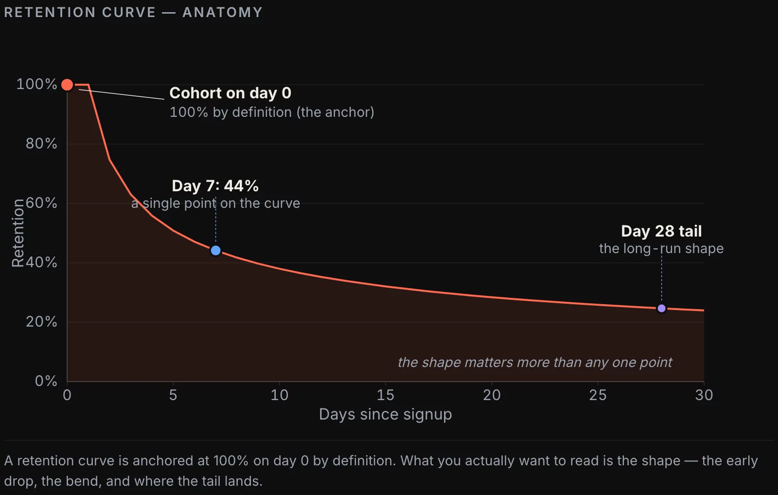
Day-N retention, in textbook form, is simple: out of the users who showed up on day 0, what percentage came back on day N. If 1,000 users signed up on Monday and 230 of them logged in on the following Monday, day-7 retention is 23%.
In practice, three things tend to drift:
- What counts as “showed up” — signup event, first session, first purchase, first non-onboarding screen. Pick the wrong anchor and you measure your onboarding funnel, not retention.
- What counts as “came back” — any session, a meaningful event, a paying event. A retention curve built on “any session” looks much better than one built on “paid action,” and the gap between them is often the actual product story.
- What the cohort actually is — install date in UTC, install date in user-local time, first-purchase date, first-billing date. Cohorts defined on local-time installs can shift 5-10% per market.
The cheapest improvement most teams can make to their retention reporting is to write the three choices down explicitly, in one place, and make every team use the same ones. Most engagements where we end up rebuilding retention reporting find that nobody had ever written this down.
Three flavors of retention, and when they disagree
The retention metric splits into at least three useful variants. They answer different questions, and we see teams using them interchangeably more often than not.
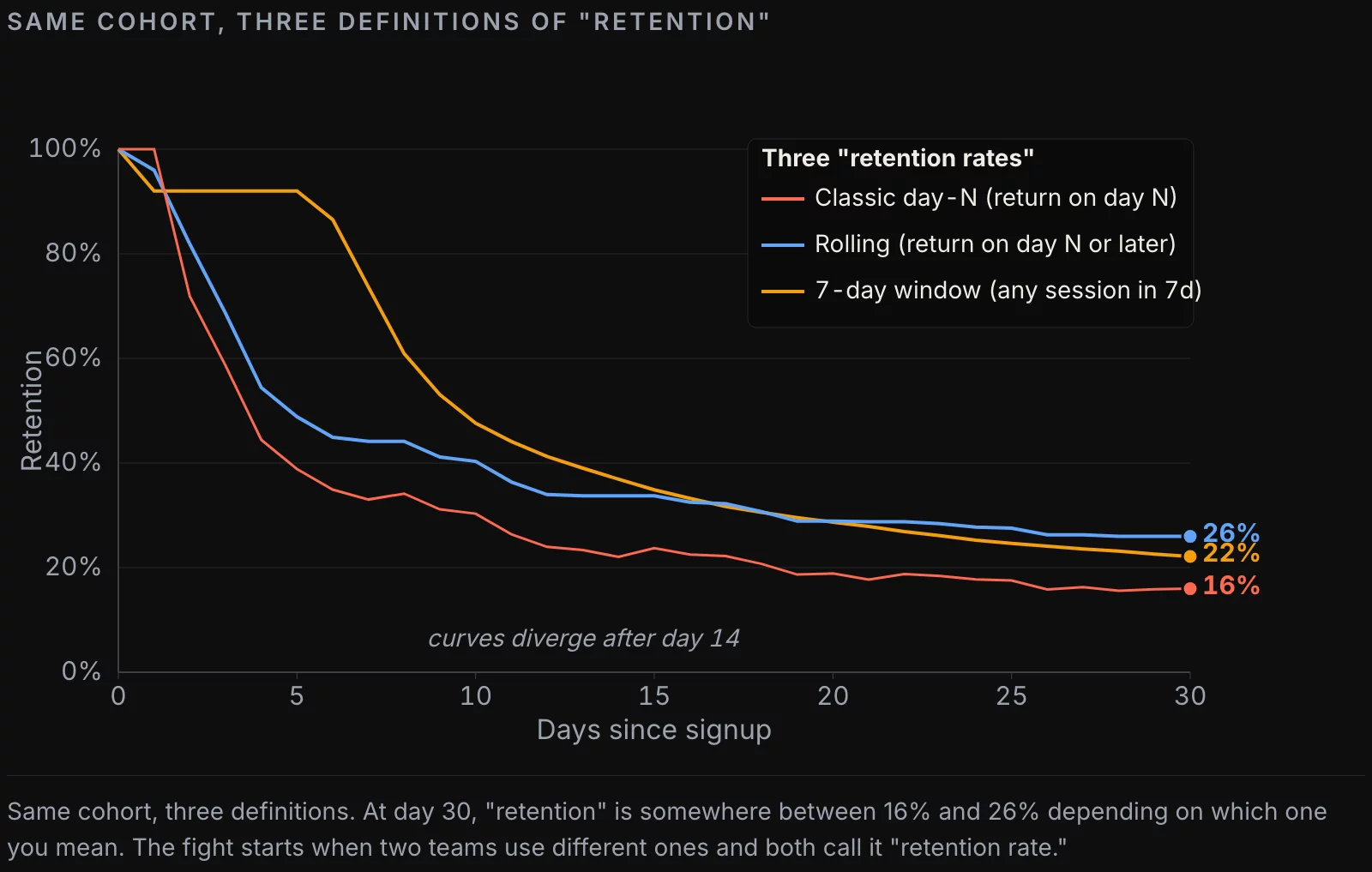
Classic day-N retention. Did the user return on exactly day N. This is the curve mobile growth teams report. It’s spiky in the first week and noisy at the tail. Useful for “what happens in the first 7 days” decisions. Not useful for “are these users still around in month 3” questions.
Rolling retention. Did the user return on day N or any day after. This curve is monotonic — once you’re rolled-in, you stay rolled-in for that observation date. It answers “is the user still alive” more honestly than classic retention does, especially for products where engagement is weekly rather than daily.
N-day retention (interval retention). Did the user have any session in days N-k..N, for some window k. Common choices are 7-day and 28-day retention. This is what consumer products (Spotify, Netflix, fitness apps) actually optimize for. It’s also what most “MAU” and “WAU” calculations implicitly use.
Pick one default for the dashboard. Have the other two available in dbt models so an analyst can swap in 30 seconds if a stakeholder asks “but what does our rolling 28-day look like.” The fight starts when one team picks classic without telling anyone and another team picks N-day, and they both call it “retention rate” in the deck.
Building the report in SQL
The shape of the query doesn’t change much across warehouses. Two source tables: users (one row per user, with a registration timestamp), sessions (one row per user activity, with a session timestamp). The query has three CTEs: cohort size, returns per day, then a join.
PostgreSQL (and Snowflake / BigQuery with cosmetic changes):
WITH cohort AS (
  SELECT
    date(registered_at) AS cohort_date,
    count(*) AS cohort_size
  FROM users
  WHERE registered_at >= current_date - interval '60 days'
    AND registered_at <  current_date - interval '30 days'
  GROUP BY 1
),
returns AS (
  SELECT
    date(u.registered_at) AS cohort_date,
    (date(s.session_at) - date(u.registered_at)) AS day_offset,
    count(DISTINCT u.id) AS returning_users
  FROM users u
  JOIN sessions s ON s.user_id = u.id
  WHERE u.registered_at >= current_date - interval '60 days'
    AND u.registered_at <  current_date - interval '30 days'
    AND (date(s.session_at) - date(u.registered_at)) BETWEEN 0 AND 30
  GROUP BY 1, 2
)
SELECT
  c.cohort_date,
  c.cohort_size,
  r.day_offset,
  r.returning_users,
  round(r.returning_users::numeric / c.cohort_size, 4) AS retention
FROM cohort c
JOIN returns r ON r.cohort_date = c.cohort_date
ORDER BY 1, 3;
ClickHouse looks almost identical, with two adjustments: replace current_date with today(), and use dateDiff('day', u.registered_at, s.session_at) instead of date subtraction.
WITH cohort AS (
  SELECT
    toDate(registered_at) AS cohort_date,
    count() AS cohort_size
  FROM users
  WHERE registered_at >= today() - 60
    AND registered_at <  today() - 30
  GROUP BY cohort_date
),
returns AS (
  SELECT
    toDate(u.registered_at) AS cohort_date,
    dateDiff('day', u.registered_at, s.session_at) AS day_offset,
    uniqExact(u.id) AS returning_users
  FROM users u
  INNER JOIN sessions s ON s.user_id = u.id
  WHERE u.registered_at >= today() - 60
    AND u.registered_at <  today() - 30
    AND dateDiff('day', u.registered_at, s.session_at) BETWEEN 0 AND 30
  GROUP BY cohort_date, day_offset
)
SELECT c.cohort_date, c.cohort_size, r.day_offset, r.returning_users,
       r.returning_users / c.cohort_size AS retention
FROM cohort c
INNER JOIN returns r USING (cohort_date)
ORDER BY cohort_date, day_offset;
Two SQL-level rules we apply on every engagement:
- Pin the cohort window explicitly. The example above looks at users who registered 31-60 days ago. Picking “last 60 days” without an upper bound mixes still-immature cohorts (registered yesterday, haven’t had time to come back on day 7 yet) with mature ones, and the curve sags artificially in the recent tail.
- Always order by
(cohort_date, day_offset)at the outer query. Some BI tools render heatmaps based on row order, not column values; an unordered result occasionally produces a heatmap with the columns shuffled and nobody notices for a week.
The three flavors in SQL
Once the base table is built (cohort × day_offset × returning_users), each flavor is a small variation. Classic retention is what the query above produces directly. Rolling retention is a running max from the right. N-day retention is a windowed sum.
Rolling retention in standard SQL:
SELECT
  cohort_date,
  day_offset,
  -- max of returning_users over all day_offsets >= current one, same cohort
  max(returning_users) OVER (
    PARTITION BY cohort_date
    ORDER BY day_offset DESC
    ROWS BETWEEN UNBOUNDED PRECEDING AND CURRENT ROW
  ) AS rolling_returning_users
FROM base_retention
ORDER BY cohort_date, day_offset;
7-day window retention:
SELECT
  cohort_date,
  day_offset,
  sum(returning_users) OVER (
    PARTITION BY cohort_date
    ORDER BY day_offset
    ROWS BETWEEN 6 PRECEDING AND CURRENT ROW
  ) AS users_active_in_last_7d
FROM base_retention;
In ClickHouse, the same patterns work with quantileExactWeighted and array functions if you prefer them, but the window-function path is usually clearer for a team reviewing the SQL.
The four ways retention reporting goes wrong
The misuses below cover, in my experience, 80% of “our retention number is broken” conversations.
1. Mixing immature and mature cohorts. This is the most common one. Someone builds a retention dashboard that shows day-30 retention for “last 60 days.” Users who registered yesterday are included with weight equal to users who registered 45 days ago, but the former cannot possibly have day-30 retention yet. Their effective retention is zero for every day_offset above their cohort age, and the average drops. Fix: cohort the dashboard with an explicit lower bound (cohort registered ≥ 60 days ago for a day-30 chart).
2. Comparing flavors across teams. The growth team says “day-7 retention is 28%.” The finance team builds the same report and says “we see 41%.” The growth team used classic, finance used rolling. Both are correct under their definition. The fix is governance: one canonical definition per dashboard, named, with a link to its definition.
3. Counting onboarding as engagement. If “session” includes onboarding screens, you’ll get a beautiful day-0 of 100% and day-1 retention 60% higher than reality. Onboarding is a funnel, not retention. Strip onboarding events from the session source, or define the day-0 anchor as “completed onboarding” instead of “signed up.”
4. Time-zone bleed. Cohorting on UTC registration and counting returns on UTC sessions, when half your users are in PT and the rest in CET, smears every cohort across a 24-hour band. Day-1 returns at 11 PM Pacific are written to the wrong cohort half the time. The fix is to either cohort and count in user-local time, or accept the UTC bias and document it.

Time granularity: day, week, month
Daily granularity is the right default for products with daily-use intent (social, communication, mobile games, fitness). The chart is noisy by nature, but the noise is the point — Mondays look different from Saturdays.
Weekly granularity is the right default for products with a 2-7 day natural cadence (most B2B SaaS, e-commerce above the impulse-buy line, learning products). Weekly retention smooths out the noise and lines up with the cadence stakeholders think in.
Monthly granularity is right for subscription products where the only behavior that matters is “did they renew.” Monthly retention overlaps with revenue retention almost perfectly there.
A team that ships a daily-retention chart for a B2B product gets a chart that bounces between 8% and 24% all week, and quickly stops using it. The metric isn’t broken — the cadence is wrong.
What modern tools hide
The retention modules in Mixpanel, Amplitude, PostHog, and Heap all let an analyst build a retention chart by clicking three dropdowns. That’s a feature; it’s also where the next consulting engagement comes from. Each tool defines retention slightly differently, and the differences are buried two or three menu levels deep.
Mixpanel. Default is N-day retention with a 7-day window. The setting is in the “Type” dropdown next to the chart. The “Born event” and “Return event” dropdowns let you change the anchor, but defaults pick whatever the team set up earliest, which is rarely what you want a year later.
Amplitude. Default is “Bracket retention,” which is N-day window retention. The “Calculate retention based on” toggle changes whether the same event triggers both born and return, or different ones — a much bigger semantic decision than the UI suggests.
PostHog. Defaults to classic day-N. The “First time” vs “Recurring” toggle changes the cohort definition without changing the chart label.
dbt + warehouse-native. No defaults are hidden; everything is in the SQL. Slower to build, faster to debug. Our default recommendation when retention sits in the SaaS KPI scorecard your board reviews is to compute it in dbt and feed the visualization layer, not to compute it inside the BI tool.
There’s nothing wrong with the tool defaults per se. The problem is that the team using the tool rarely knows what default applies, and a quarter later somebody changes a dropdown without telling anyone and the curve looks different for unexplained reasons.
A checklist for shipping a retention number
Before a retention number lands on an executive dashboard:
- Anchor event is documented in plain English
- Return event is documented in plain English
- Cohort window has an explicit lower bound (so cohorts have time to “mature”)
- Flavor (classic / rolling / N-day) is named in the chart label
- Granularity (day / week / month) matches product cadence
- Onboarding events are excluded from the return-event definition
- Time-zone policy is written down (UTC or user-local), consistently applied
- Underlying SQL is in version control (dbt model, not a BI-tool query)
- At least one historical anomaly (e.g. “Sep 2024 dip from the auth migration”) is annotated on the chart
If any of those are missing, the metric isn’t ready for the boardroom yet. It’s a draft.
Further reading
The retention metric pairs naturally with two related models: cohort analysis (which dimension to slice the curve by) and LTV (which uses the retention curve as input). We’ve covered both elsewhere on this blog.
- Cohort Analysis in 2026: Beyond Redash, Beyond Mixpanel — the dimensions that actually move the curve
- Modeling Customer LTV in SQL: From Naive to Defensible — turning the retention curve into a forecast
![[REVIEW] Looker Studio vs Power BI 2026](https://valiotti.com/wp-content/uploads/2026/06/looker-studio-vs-power-bi-2026-hero-768x512.png)