Data-Rich Tableau Dashboards Allowed Telecom Provider Wing to Reduce Shipping Times Across the US
Goal
- To visualize the information provided by the Wing team on several Tableau dashboards for enhanced analytics and data-driven decision-making. In particular, the client needed to visualize how the credits were issued to uncover discrepancies and fraudulent cases. Moreover, they had to visualize insurance plan allocation, ARPU, and total revenue on state and zip code levels to refine their marketing efforts and see if they could target specific demographics or high allocation areas.
- To provide actionable insights on shipment allocation to reduce the shipping time and optimize the supply chain across the US.
- The Client lacked the expertise and human resources necessary to build efficient analytical dashboards and reports in Tableau, here’s why they chose Valiotti as a reliable data analytics expert.
Results
- Data-rich dashboards in Tableau
Based on the acquired information and queried databases, we built several dashboards in Tableau.
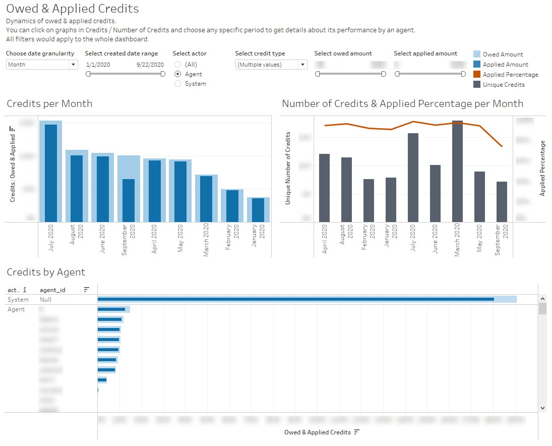
- The Owed and Applied Credits dashboard shows the number of credits issued, including the applied percentage and unique credits, per month
The dashboards also provide information on specific users. They can be analyzed by user type, the cost of credit per user, the data range, and the outlier ratio for the Client to provide a comprehensive outlook of credit issuing and user purchasing behavior.
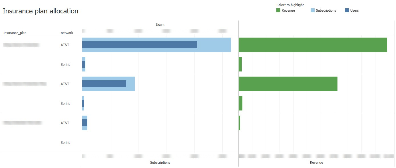
- The Plan Allocation dashboards cover subscription details and allocation, ARPU, and Revenue.
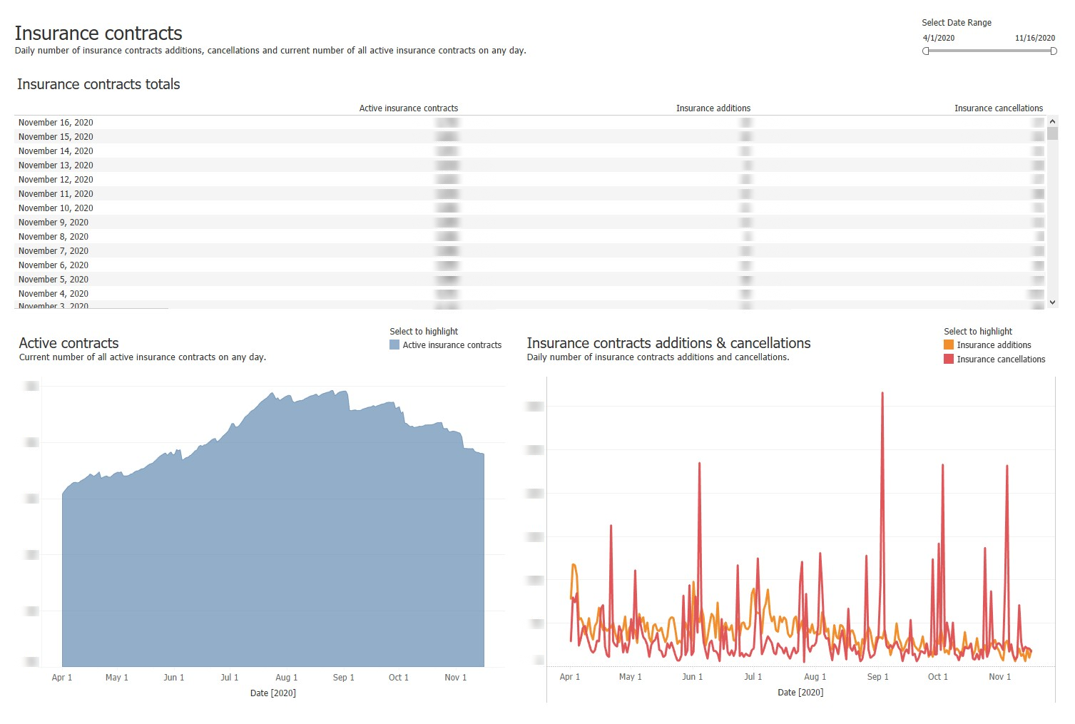
- Insurance dashboards showcase the number of insurance contract additions, cancellations, and active insurance contracts on a daily, weekly, and monthly basis. What is more, we analyzed insurance plan allocation by revenue, number of subscriptions, and users for different insurance plans and networks.
- Actionable data-based insights into top shipment hubs
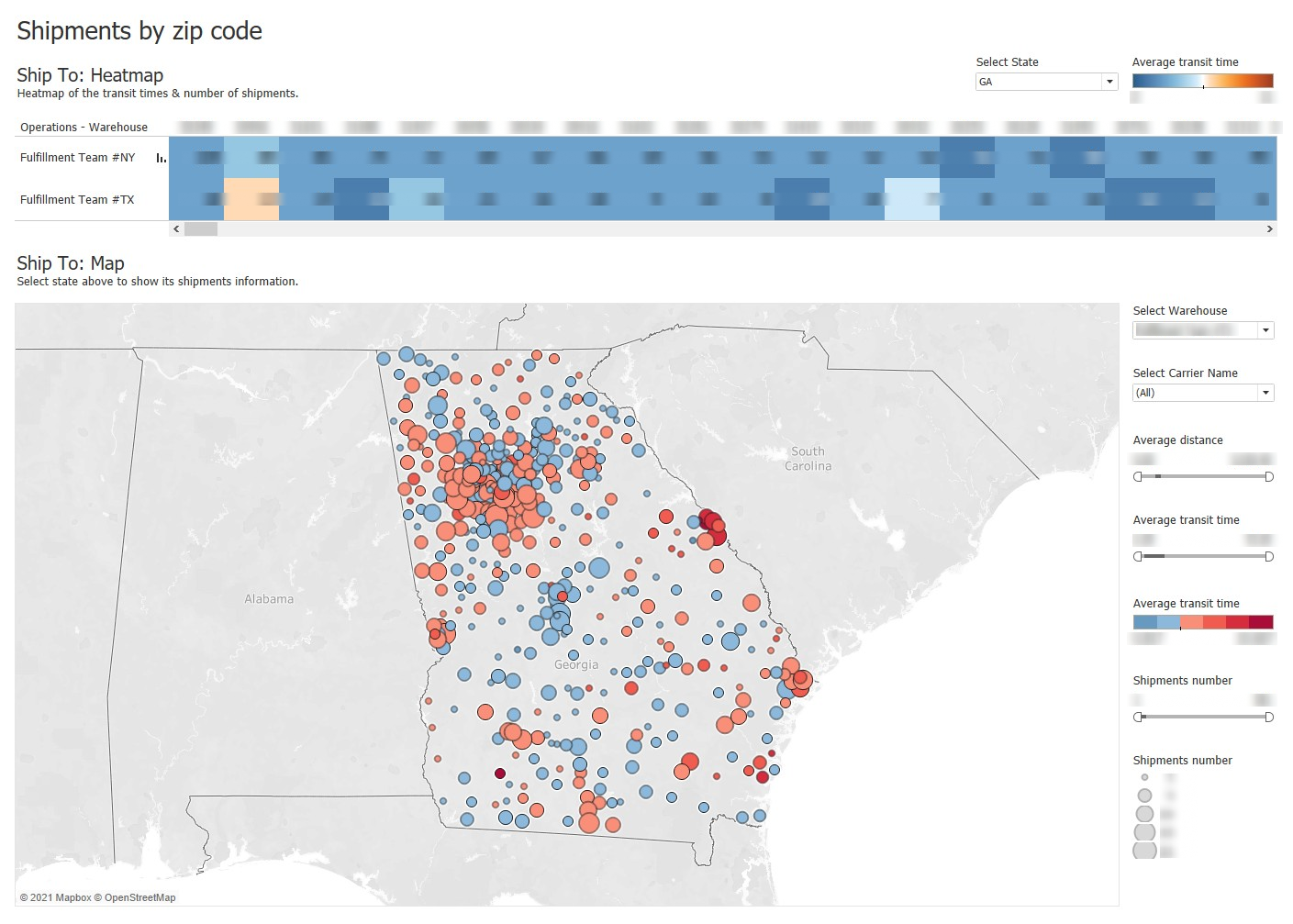
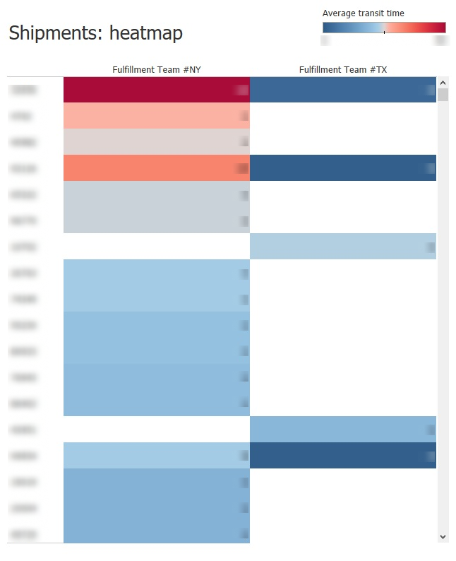
We built a heatmap of the number of shipments and transit times and analyzed the results of different warehouses.
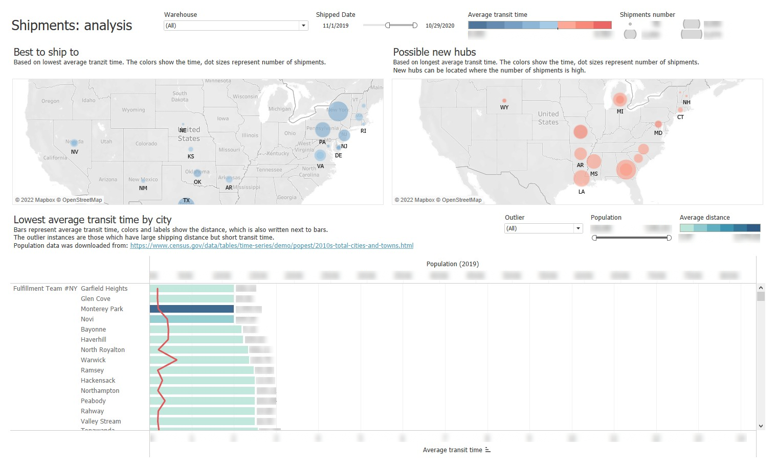
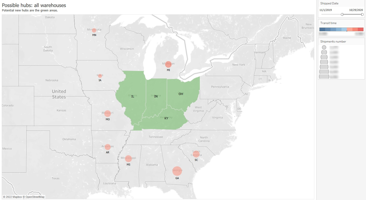
As a result, we came up with omitted locations that are worth shipping to (possible new hubs) and cities with the lowest average transit times. A surprising insight was that some cities with high delivery distances boasted rather short delivery times.
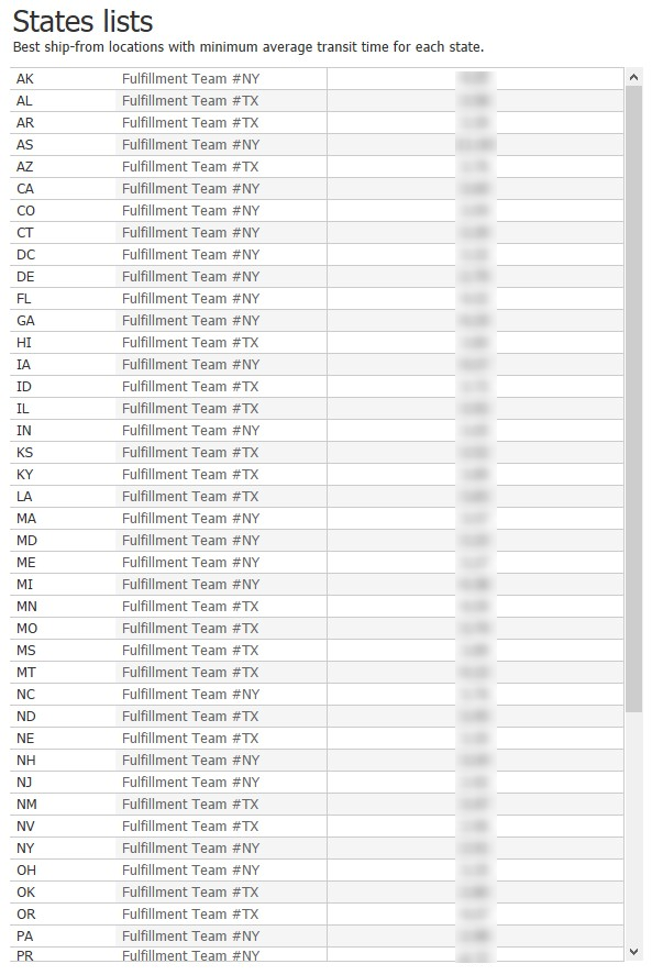
We analyzed the supply chain in terms of US cities and states to identify the best ship-from locations with minimum average transit times.
As a result, shipment dashboards have helped the Client to identify the best shipment locations, cities, and regions with the fastest transit times and a place to build a new warehouse to help reduce delivery times.
Tips
- Carefully study the data and ask detailed questions to avoid mistakes in visualizations. Valiotti always devotes a lot of time to the preparation stage to get a clear understanding of the Client’s situation.
- Get familiar with the required stack of tools. In this case, it was Tableau Desktop, as it offers rich functionality.
- Suggest different options for visualizing to find the most task-suitable one.
Learn How Data Insights Can Benefit Your Business
Wondering what value data insights can bring your business? Get in touch, and we'll answer your questions!
Other Case Studies


