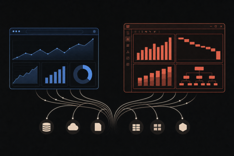
Most charts and dashboards we review have one obvious typographic problem and 3 or 4 small ones. The obvious one is that the body labels are unreadable at the size the dashboard is actually shown. The small ones are subtler: numbers that wobble out of alignment, axis labels that fight the gridlines, a heading that reads heavier on Tuesday than it did on Monday because the font got swapped to whatever the BI tool defaults to.
In This Article
- The job of a chart label is to read like it is not there
- X-height is the single best predictor of small-size readability
- Open apertures or you cannot read the numbers
- Avoid serifs in chart labels, use them sparingly in headings
- Numbers need to align, which means they need to be tabular
- A working two-font system is plenty
- Five reference systems you can copy
- A short checklist before the dashboard ships
- Further reading
Fonts in data visualization are a different problem from fonts in body text. The text is small. The text contains numbers. The reader is scanning, not reading. None of the typography advice that works for blog posts and marketing pages applies cleanly. This piece is the short version of the rules we actually use, with the specific Google Fonts we keep reaching for.
The job of a chart label is to read like it is not there
The first principle is the one easiest to forget. Good typography in a dashboard does not announce itself. The reader looks at the chart, reads the axis labels and the numeric callouts, and leaves with the information. If anyone notices the font, the typography failed at the only thing it had to do.
This means the goal is not to find an interesting font. The goal is to find a font that disappears at small sizes, gives the eye a steady rhythm across labels, and aligns numbers cleanly when they sit in a column. Almost every font that achieves this is a sans-serif with a generous x-height, open apertures, and tabular numeric support. There are maybe a dozen of them in the free Google Fonts catalog. Three of them cover 90 percent of the work.
X-height is the single best predictor of small-size readability
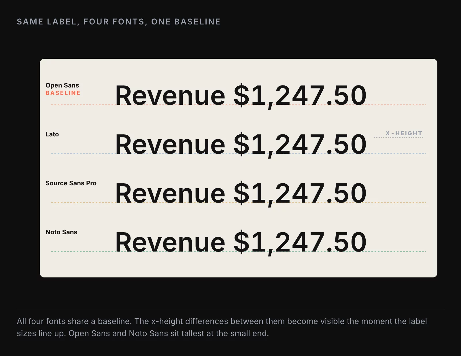
X-height is the height of a lowercase x compared to the uppercase letters. Fonts with a large x-height look taller and rounder at small sizes. Fonts with a small x-height look pinched. The difference at body text size (16 or 18 points) is small. The difference at chart-label size (10 or 11 points) is enormous.
Open Sans, Noto Sans, and Lato all have generous x-heights and read well at the sizes dashboards actually show text. Inter, which is the modern default for a lot of UI work, has an even taller x-height and works similarly well. At the other end of the scale, fonts like Raleway and Montserrat have shorter x-heights and look elegant in headlines but turn into a smear at 10 points. Save them for cover slides, not chart labels.
A practical test: render the word “Revenue” in your candidate font at 10 points, screenshot it, and zoom to 200 percent. If the round shape of the e and o is still recognizable, you have enough x-height. If they collapse into vertical slits, the font is wrong for chart labels at that size.
Lato is slightly different from the rest of the cluster. Its x-height is good, but its line lengths run a touch short, which means the eye covers more ground per unit of information. That is usually a benefit on a dashboard, where horizontal real estate is tight.
Open apertures or you cannot read the numbers
Aperture is the opening in letters like c, e, a, and the holes inside p, b, d, and o. Open apertures let the eye distinguish letters quickly at small sizes. Closed or pinched apertures (the kind you get in compressed display fonts like League Gothic, Futura Condensed, or Bebas Neue) erase the difference between a c and an e the moment you drop below 12 points.
This shows up most painfully on numbers. The difference between 8 and 0 collapses in fonts with tight apertures. The difference between 6 and 5 collapses in fonts with closed bowls. On a chart label that reads “$8,520” you can end up looking at “$0,520” without realizing it, which is a worse outcome than the dashboard not existing.
The rule is the same as for x-height: when you have to choose, pick the font with the more open shapes. The free Google catalog gives you Source Sans Pro, Libre Franklin, and Assistant in this category. All three are safe bets for chart and table work.
Avoid serifs in chart labels, use them sparingly in headings
Serifs in body text aid reading by giving the eye small visual anchors. Serifs in chart labels do the opposite. The serifs add visual mass to small text, blur the letter shapes, and turn dense label sets into a furry stripe of gray. The number “8” in a serif font at 10 points is a worse number than the same 8 in a sans-serif.
The exception is headings, where serifs can add useful weight and personality. A serif heading paired with sans-serif labels reads as editorial and considered, which is the right register for an executive report or a curated dashboard. Merriweather and Lora are the two Google fonts we would reach for here. Both have enough weight at heading sizes and large enough x-heights to not pinch when rendered against a dense table of sans-serif numbers below.
Mixing a serif heading with sans-serif body and labels is the typographic system the New York Times built much of its data work on, and it is the easiest “two-font” system to make work if you have not done much type pairing before. Merriweather plus Source Sans Pro is the safe version of that pairing in the Google catalog.
Numbers need to align, which means they need to be tabular
This is the rule that most BI tool defaults break, and it is the one that does the most damage.
There are two families of numeric figures in a typical font. Proportional numbers vary in width. A 1 is narrow, an 8 is wide. They look natural in body text, where numbers occur in flowing sentences. They look broken in a column of revenue figures, where the decimal points end up at different x-coordinates on every row and the eye has to do extra work to compare magnitudes.
Tabular numbers are designed for tables. Every digit takes the same width. The decimal points line up. The thousands separators line up. A column of “$1,247.50” and “$98.20” and “$12,041.95” reads as a clean stack the eye can scan in half a second.
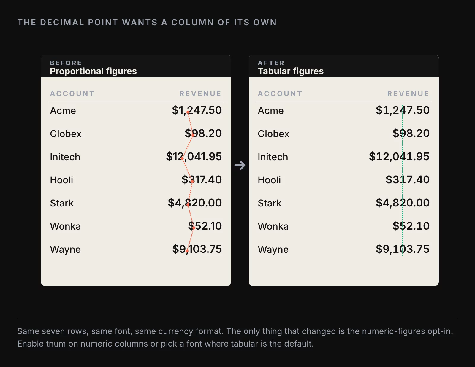
The Google fonts that get this right out of the box include Open Sans, Noto Sans, and Inter. Lato has tabular figures available but defaults to proportional, so you have to opt in via the font-feature-settings: "tnum" CSS property. Raleway and a few of the more decorative sans-serifs ship with old-style figures (the kind with descenders below the baseline, like an old-fashioned 7 that drops below the line). Old-style figures are gorgeous in book typography and unusable in data visualization. They make every column of numbers look like it is moving.
The fix in a BI tool is usually one of two things. If the tool exposes a font-feature setting, enable tnum on the columns that contain numbers. If it does not, pick a font where tabular figures are the default. Open Sans is the most reliable choice across the BI tools we have used. Inter is a close second on the tools that support it.
A working two-font system is plenty
There is a small typographic literature on multi-font systems for data visualization. Five different systems, five different rationales, five different sets of recommended fonts. The honest version is that you only need two of them, and one of those two is often optional.
A working two-font system looks like this:
- A sans-serif for body text, axis labels, table cells, and chart annotations. Pick one with high x-height, open apertures, and tabular figures. Open Sans, Noto Sans, Source Sans Pro, or Inter all work.
- An optional second font for headings and section titles. If you want editorial weight, use a serif (Merriweather, Lora). If you want a cleaner modern feel, use the same sans-serif at a heavier weight (Lato Bold over Lato Regular, for example).
That is the entire system. Two fonts, four to five weights total (regular and bold of each, plus a light if you have a use for it), and one rule: numbers are always tabular.
If you find yourself wanting a third font, take a step back. Three fonts in a dashboard is usually a sign that the design is solving a problem that better hierarchy and color would solve more cheaply. Three fonts also means three sets of webfont loads, three caches, three opportunities for the font swap to flash a different glyph during loading.
Five reference systems you can copy
For specific dashboard contexts, the five reference pairings worth knowing:
One font, one size. Use a single sans-serif at one size for everything, and rely on weight and color for hierarchy. Good for compact business dashboards where the focus is the data and the chrome should disappear. Lato is the go-to for this approach.
One font, large heading. Same single sans-serif, with the dashboard title set substantially larger and heavier than everything else. Good for executive reports where the headline insight needs to dominate. Assistant from the Google catalog works well here because it has strong weights at the heavy end.
Two sans-serifs, heavy and light. A heavier sans for headings, a lighter sans for body. Works for editorial dashboards and longer reports. PT Sans Bold paired with Noto Sans is a clean version of this pairing.
One serif, one sans. A serif for headings, a sans for body and labels. This is the New York Times pattern. Merriweather plus Source Sans Pro is the Google-catalog version.
Serif for reading, sans for labels. Serif for the entire reading layer (headings, subheadings, paragraph copy), sans only for axis labels and numeric callouts. Best for long-form data essays. Lora plus Libre Franklin is the pairing we would recommend.
Pick one of the five based on the publication context, and then do not change. The cost of switching fonts mid-dashboard is the same as the cost of switching fonts mid-publication: the design now looks like it was made by two different designers who did not talk to each other.
A short checklist before the dashboard ships
A list to run before merging:
- All numeric columns use a font with tabular figures, or have
font-feature-settings: "tnum"enabled - Decimal points align in every numeric column
- Axis labels and table cells render legibly at the actual display size (test on the screen the dashboard will be viewed on, not on your dev monitor)
- No more than two font families are loaded
- Headings and body share a deliberate weight relationship (not two random weights that happen to look fine)
- No condensed or display fonts in label positions
- No old-style figures in numeric columns
- One consistent pairing across every chart on the dashboard
A dashboard that passes those eight items will read clean to a stakeholder, even if nobody on the team can articulate why. The dashboards that fail one or two of them feel “off,” and the team usually attributes the feeling to the data or the layout, when the cause is a font choice three levels deeper than anyone is looking.
Further reading
- Color Palettes for Data Visualizations, the other half of the visual layer that lives or dies on small defaults
- 10 Dashboard Design Rules, 6 Years Later, the layout principles the tabular-figures rule is in service of
About the author
Nick Valiotti is the founder of Valiotti Data. 15+ years building analytics infrastructure for SaaS, marketplaces, and consumer subscription. 50+ production deployments across BigQuery, Snowflake, dbt, Metabase, and modern BI stacks. Author of two books on data strategy. LinkedIn · Discovery call.